People sometimes ask me how I write my interactive tutorials. I started out using d3.js[1], and I wrote an interactive tutorial about how I made interactive pages with d3.js. I now use Vue.js v2[2], so I'm writing this tutorial about how I make interactive pages with Vue. I'll recreate the first few diagrams of my circle drawing tutorial. The ideas here will be similar if you use Vue v3 or React or Preact or Lit or Svelte etc.
In this tutorial I'm using SVG for the diagrams. DOM-manipulating libraries like d3 and Vue work with both HTML and SVG. I usually choose SVG unless there's some specific reason to choose Canvas or WebGL.
The goal is to implement interactive diagrams like this:
1 Web page#
I usually start with a basic web page template that includes scripts, footers, and one blank SVG diagram:
I attach an id= to an html element so that I can get to it from JavaScript. Sometimes I'll attach it to the <svg> and sometimes to a <div> or <figure> outside the diagram. For this page, I want interactive elements outside the SVG diagram so I'm putting the id on the <figure>.
I use a viewBox on <svg> to tell it the coordinate system I want for drawing. I can use that to keep a consistent coordinate system even if the diagram is resized. I've hard-coded it for now but later on I'll show how to calculate it dynamically. I temporarily set CSS background or border on the new SVG so that I can see what space it occupies on the page.
For the rest of the page I'll focus on the diagrams and won't show the header, footer, and text of the page.
2 Diagram#
Sometimes I'll add a diagram first and then add some text; other times I'll start with the text and then figure out the diagrams. For this page I'll start with a diagram.
The tutorial is about drawing circles on a square grid, so I need to draw a grid and also draw circles. I'll draw a grid with SVG. I start by making one grid cell. I can write out the SVG for it:
That's plain HTML+SVG. I could've created that SVG with an interactive editor but in this case I wrote it by hand. But I want many grid cells. I want to repeat it, varying the position each time:
How does this work? In Vue, v-for means to repeat an element. In this case, it will create one <rect> for each element in the positions array. The :x= syntax means it's setting x attribute by calculating the JavaScript expression q * scale.
Let's look at the JavaScript powering the page:
I first build that positions array. Here I'm using the variable names q for column and r for row. These are grid coordinates. I use variables x, y for the diagram (pixel) coordinates. I find that when I use x, y for both, I end up with more bugs.
Once I have the positions array, I tell Vue to go to work on #diagram, the HTML <figure>. I have to export variables from JavaScript to the document by listing them in data.
The v-for syntax is specific to Vue. In React, I'd use positions.map(…) to make an array of <rect>. In Svelte I'd use #{each … in positions}. In Lit I'd use ${repeat(positions, …)}. Each library has a way to loop over arrays, but the syntax differs. I'm showing Vue on this page but the concepts are similar across these libraries.
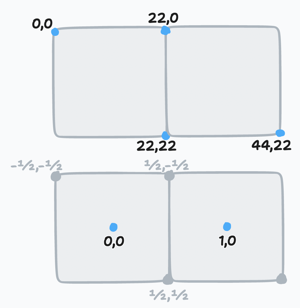
Those of you who know SVG might choose to use viewBox or transform to change the coordinate system to place points at the center of each grid square instead of at the top left, and also to scale things so that each grid square is 1 unit across instead of scale pixels. On this page I start out with a conventional coordinate system with 22✕22 top-left positioned tiles, and later on show how 1✕1 centered tiles simplifies the code.
3 Detail: negative space#
While working on a page, I'll sometimes work on the details during the process and sometimes towards the end. On this page I'll work on them during the process. For the grid, I sometimes use negative space. Drawing the edges in the foreground color leads the reader to focus on the edges. Instead, I'll draw the edges in the background color so they don't draw the focus, and then color the tile in gray or some other color.
I don't do this for all pages. I use this on the A* pages, where the attention should be on the paths, but not on the hexagon pages, where the attention should be on the grid itself. Sometimes the color scheme doesn't allow for it.
4 Algorithm#
The most obvious thing to do with an interactive diagram is to run the algorithm and display the results. In this case, the first algorithm I present on the page is a distance test in C++:
bool inside_circle(Point center, Point tile, float radius) {
    float dx = center.x - tile.x,
          dy = center.y - tile.y;
    float distance = sqrt(dx*dx + dy*dy);
    return distance <= radius;
}

for (int y = 0; y < height; y++) {
    for (int x = 0; x < width; x++) {
        if (inside_circle(center, Point(x, y), radius)) {
            // do something with (x, y)
        }
    }
}
This returns a bool for each tile. In the diagram, I can use a color to show that boolean value.
But the sample code is C++ and the diagram code is JavaScript, so I have to decide what to do here. I could compile the C++ to WASM so that I can directly call it from JavaScript, but in this case it is easier to reimplement it. The next question is where should it go. I could either call insideCircle and then choose the color in the HTML, or I could have the HTML call tileColor and have that function select the color in JavaScript. I decided to select the color in the HTML. In Vue, a function has to be exported to make it available in the HTML template, but that detail will vary in React, Svelte, etc.
I also need to decide where to store the circle center and radius. I decided to put those into the Vue data, which stores the state for that diagram. I will later want to make these interactive.
One thing to note is that I didn't implement the entire algorithm. The full algorithm has a loop over tiles, and then runs the test for each tile, and collects the results. But in the diagram, the loop is implicit. I don't actually need to collect the results.
This happens a lot. The code for the diagram is not the same as the original algorithm. The point of the diagram is help the reader understand the concepts. It's not to demonstrate that I know how to implement the algorithm. For example, in this article about the quadratic formula[3], it would be easy to run the quadratic formula and give the answer. But the diagrams do something quite different, showing how completing a square relates to the quadratic formula.
5 Interaction#
The diagram is now showing the output of the algorithm, but it's not yet interactive. The obvious thing to do is to allow the reader to change the inputs. In this case the inputs are the center and radius of the circle. Let's add sliders to control those three numbers:
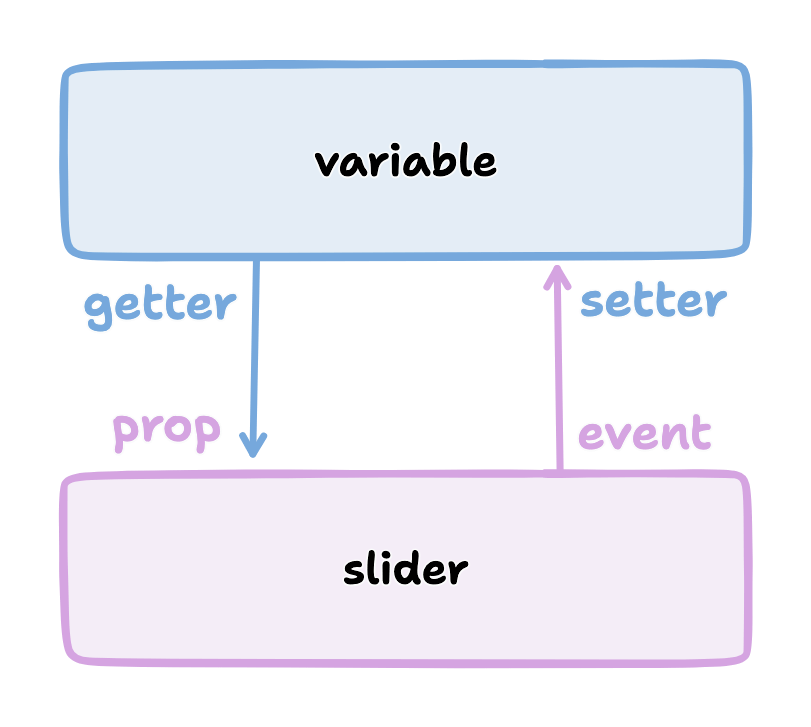
The syntax varies slightly across libraries:
| prop | getter | event | setter | |
|---|---|---|---|---|
| Vue | :value= | "value" | @input= | "value = $event.target.value" |
| Alpine | :value= | "value" | @input= | "value = $event.target.value" |
| Svelte | value= | {value} | on:input= | "e => value = e.target.value" |
| React | value= | {this.state.value} | onChange= | {e => this.setState({value: e.target.value})} |
| Lit | value= | {this.value} | @input= | ${this.value = e => this.value = e.target.value} |
Binding is how we connect the HTML and JavaScript parts of the page. The prop+event get+set pattern is common enough that Vue has a convenient shorthand syntax[4]<input v-model="value" />. Alpine uses <input x-model="value" />. Svelte uses <input bind:value={value} />. React used to have valueLink[5] but now recommends writing them out separately. In Lit I also write them out separately.
With the radius, I have two <input> elements, both set to the same variable. Sometimes it's useful to be able to edit the variable in multiple ways. The editable variables need to be exported in Vue's data section, but I already had them there so I didn't have to change the JavaScript in this step.
6 Direct manipulation#
Sliders are easy to implement, since the browser already supports <input type=range>. When editing a geometric parameter like position, it's often better to directly manipulate the position by dragging it than to indirectly manipulate it by using a slider.
The bad news: this is where things get trickier. The good news: once I figured this part out, I reused it across lots of projects. I'm going to start with the simpler implementation, but there are many more details that can be added.
The first thing to do is add a handle. This is an object that represents the underlying variable, and is something the reader can drag around. The circle center is in grid coordinates, and I need to turn them into diagram coordinates. To do that, I add 1/2 so that the circle is centered inside a tile, then multiply by scale.
So far it's in the SVG but there's no behavior. Let's add some behavior to it:
Here's where it gets tricky. To go from the center in grid coordinates to a position in the diagram, I added 1/2 and then multiplied by scale. But that's in SVG coordinates. In almost all cases I can work in the SVG coordinates, but mouse events come in screen coordinates, so there's an extra step to convert that to SVG coordinates:
- Convert screen coordinates to SVG coordinates, using a helper function.
- Convert SVG coordinates to grid coordinates: I divide by
scaleand then subtract1/2.
For the first, I use a helper function. It's useful across projects. It doesn't handle all cases, and probably can't because of browser bugs[6], but it handles many of the cases I need it to handle. With an extension it can take into account SVG transforms.
For the second, I use this event handler, which gets called by @pointermove="moveCenter":
This kind of two-way mapping from data to diagram and back is common, and I occasionally go overboard and write a library to handle it. But in most cases I write it manually.
If you try the demo you'll notice it doesn't work that well. There are three problems here:
- Mouse move hover events don't work well on most touch devices unless you're holding down a button or finger. The solution is to make it move while the mouse button / finger is held down.
- You can move the drag handle only while the mouse is on top of the drag handle. The solution is to use pointer capture[7], which directs all mouse move events to the drag handle while the button / finger is being held down.
- The drag handle isn't snapping to the grid tile, and it can also go off the edge of the grid. The solution is to use
Math.round(), and thenclamp().
Here's the version with dragging instead of mouseover:
To implement this, I need a dragging flag and a pair of event handlers to update it:
Details →
Pointer events unify touch and mouse, but touch devices also let you scroll the page. I want to prevent touchstart on the drag handle from scrolling the page. Mouse devices also let you drag text, when text is selected. I want to prevent dragstart to prevent dragging text. Then pointerdown+pointerup let me track whether the mouse/finger is held down. I want to start drag only on the left mouse button so I use pointerdown.left. The pointercancel handler gets called for various reasons[8] and I use that to reset the dragging status.
We're not done yet! I want to snap the drag handle to the nearest grid tile, using a reusable helper function clamp():
There are some other details to take care of. Touch events also scroll the browser view. I need to prevent the @touchstart event from its default action to stop the scrolling when dragging the handle.
It works now. It could be better. Even though some of this code is reusable across projects, it's still a bit of work to make draggable handles. The JavaScript file went from around 40 lines to 100 lines. I often start with sliders and try out the diagram before implementing drag handles.
7 Reusable drag handle#
Dragging the circle center around is nicer than setting the two sliders. It might also be nice to adjust the circle radius that way. The simplest thing to do is to write similar code for the radius as I did for the center. But this is usually the time when I start wanting to make the dragging functionality reusable. In Vue, React, etc., this can be a "component". This component will be reusable across projects.
Any time I'm turning multiple instances of something into a reusable abstraction (class, function, module, component, etc.), the key question is: what parts are common and what parts are differing? The common part is that I'm going to have a <circle> with the pointer event handlers. The differing parts are going to be the size, color, and how the data maps to the position and back. The common parts go into the abstraction, and the differing parts go into the parameters.
In the previous section I mentioned that it's common to have a two-way mapping, from original data to diagram position, and from diagram position back to data. With the circle center, that involved converting from grid coordinates to diagram coordinates by scaling and adding. But the radius will be converted differently. Vue offers a way to do this called computed values. Here I map center (grid coordinates) to centerPosition (diagram coordinates) using the getter, and map the other direction using the setter. It's the same code as in the previous section but now I've put the two mappings together in one place:
I can then refactor the previous section's code into a component that takes the position, color, and size as parameters. It'll be similar in React, Svelte, etc.:
The code is similar to what I wrote in the previous section, but the refactoring adds two things. The props are the parameters being passed down. The this.$emit is an update event being sent up. In Vue there's a shorthand syntax[9] I can use if the thing being changed is named value and the update event is named 'input':
See the diff→
computed section.Does the new component work? Let's try it:
Ok, great! I now have a reusable drag handle component.
I should point out that I usually do not try to make something reusable right away. I write it in a non-reusable way, get it working, then wait until I have a second (or third[10]) need for it before I turn it into an abstraction.
8 Radius handle#
Let's use the new component for changing the radius. I need a way to map the radius to a position on screen and back.
and then I need to add the drag handle to the HTML:
And … it works! There are now three ways to control the radius, and they all stay in sync:
Note that there are no explicit redraw() calls here. In Vue, if I modify the data, it will automatically figure out which parts of the diagram need to be redrawn. If you're using React, Svelte, etc., the redraw will work a little differently.
9 Distance diagram#
The diagram shows the output of the algorithm, but to explain how an algorithm works, I want diagrams that show the concepts behind the algorithm. I want to add more diagrams on the page, so I need to have more <figure> tags, and also need to change the JavaScript to instantiate all the diagrams instead of one. Where previously I was telling Vue to look at a single element "#diagram" , I'm going to loop through the diagrams using for (let el of document.querySelectorAll("figure")) and tell Vue to run on each of them independently.
See the diff→
Now I have two identical diagrams:
Notice that because I created two separate instances of Vue, the two diagrams have their own data including center and radius. Sometimes I want them to be in sync and sometimes I want them independent. Here I implemented them as independent values. If I want them to be in sync, I'll create a Vue.observable() with only data and no diagram, and then I'll point the other diagrams at the shared data.
I use copy/paste here instead of immediately building reusable abstractions because I've found that when I build the abstraction first, it makes my diagrams worse[11]. I find myself wanting to use the abstraction rather than making the best diagram for each situation. The abstractions are better when I wait to see what's in common.
The main concept here is distances, so I want to make the second diagram show distances. To implement this, I added <text> to each grid tile, using Vue's {{…}} to evaluate a JavaScript expression to set the text:
Here's the result.
10 Detail: appearance#
I'm going to focus on the second diagram for a bit. The black text on red squares is a bit hard to read. I can change it to white but only when the square is red. The logic is starting to feel duplicated, and I'm wanting to refactor it, but I will wait a bit longer.
See the diff→
The text labels take a bit too much space when the distance goes over 10. I can shrink the text the text a little bit by reducing precision. The logic for this is a bit too much to put in the HTML, so I moved it into a method. Another option would be to reduce the font size as the distance increases.
The result is looking a little better.
But is it, really? No! (I didn't realize this for over a year after publishing[12])
What is the purpose of this diagram? I'm trying to show distances. I want to distinguish the distances inside the circle from the ones outside the circle. But I don't actually need to show the output of the algorithm here. Do I need the red at all? I was using the red because the first diagram did. The red is a bold color and draws the reader's attention. If distances are the main idea here, then distances should draw the reader's attention.
So let's design this diagram around distances.
- Show the distances in two different colors for inside and outside the circle.
- Show the circle itself to see what we're approximating.
- Reduce the empty grid space and give more space to the circle itself.
- Make sure the drag handles are visible against the new background colors, and change the mouse pointer shape to let the reader know those objects are draggable.
See the diff→
I think this design without the red areas helps the reader focus on distances.
There's a bit more I want to do with the distance diagram but I'm wanting to refactor. I try to wait before I refactor but I think the repeated v-for loop and the repeated insideCircle() calls could be simplified. I'm using SVG <g> to group the elements together so that I can use a single v-for loop. The transform on this will position elements on the center of the tile. Then I'm calling insideCircle() just once, and assigning the result to a class:
I can use that class with CSS rules to apply the color and font changes:
There's always more refactoring that could be done but I have to balance my desire to make everything clean with my desire to finish the page. I try to remind myself that the end user (the reader) doesn't directly benefit from my abstractions.
11 Radius display#
The algorithm is about comparing distances to the radius. The current design shows the distances. After removing the radius slider, there's no place that shows the actual radius. I could display the value with a measure line and also in the figure caption. To implement the measure line, I want to use arrows. In SVG, I use markers[13]. It'll be an arrow pointing left, the measurement, and an arrow pointing right. I adjust the starting position of the line to give a little room for the label.
The SVG is a little messy, and I'll clean it up later:
It relies on the line positions, which I calculate here:
The <figure> element has an optional <figcaption> description of the figure, and I can generate that dynamically here:
And here's the output:
In the previous section I removed the red because it was attached to the algorithm output, and I didn't want the output to be the main focus. Here I've added red back to show the radius. That's the number I want the reader to focus on. There are plenty more details that can be added to this diagram; compare to the original diagram.
Writing all this SVG by hand seems a little bit tedious. I've considered diagramming tools like Penrose[14], but I haven't found anything that fits my needs. I've also considered writing my own libraries but my current strategy is to have many simple one-offs instead of one general-purpose diagramming tool with all the features.
12 Coordinate systems#
There are a lot of +1/2 and * scale expressions in the code. For example:
This simplification also means I no longer need the helper functions for measureLineCenter, measureLineLeft, measureLineRight:
Ideally I would've made this change much earlier in the process, but sometimes I go too far before stopping to think about how to simplify things! But this change simplified things and I'm glad I made it.
See the diff (long)→
scale to 1 and also shifted everything by half a tile.SVG, Canvas, and WebGL all support using transforms. Use them to make the diagram code simpler.
13 Bounding box diagram#
The next diagram on the page started out as a variant of the previous one. When making two variants of a diagram, the easiest thing is to copy/paste, even though we've been taught not to. The disadvantage of copy/paste is that if you want to change both diagrams then you have to make the changes twice. The advantage of copy/paste though is that it's easier to make the diagrams different. I don't know ahead of time that these two diagrams should be the same, and I've had better results by letting the two diagrams evolve separately, and then looking for similarities to refactor.
The focus of this page is the bounding box. Let's highlight the bounding box. Outside the bounding box the algorithm doesn't calculate distances, so let's remove those distances from the diagram.
I implemented this by adding a bbox bounding box computed value, and then applying a different style to tiles outside the bounding box. See the diff→
I also want to add measure lines labeling the bounding box. I added two columns and one row to the SVG size to make room for the labels.
This change was entirely in the HTML, and didn't require changing the JavaScript. It's four gray lines, four arrows, and two labels. Changes like this allow me to have multiple diagrams that share JavaScript but differ only in the configuration parmaeters. See the diff→
14 Refactoring#
I have three diagrams now. I've added things to the later diagrams that could be in the earlier ones too:
- The 1 ✕ 1 tiles are easier to work with than the
scale✕scaletiles. - The
arrowCSS class handles the styling of arrow lines. - The
<figcaption>describes the diagram. - The
.inside-circle,.inside-boundsCSS classes are simpler than setting colors inline in the HTML. - The SVG
viewBoxis calculated instead instead of hard-coded.
The three diagrams can share some of their implementation:
- The SVG
<defs>section is the same among all SVGs on the page, so it can be shared in a hidden 0✕0 SVG. Note that if you want the defs to be different, they need to use differentidvalues, because HTMLidhas to be unique on the page, not only within an SVG. - The CSS is fairly similar but the tile color in the first diagram is red instead of gray. I used common CSS to set all three, then a more specific CSS rule to override the gray color in one diagram.
- The JavaScript code for all three diagrams is the same, so the diagrams differ only in their HTML. I can make more variants of this diagram by tweaking the HTML.
The grid of tiles is the only thing left that might be worth factoring out of the diagram code, but it's only worth it if I'm going to make several more diagrams in this style.
15 Summary#
This page is about how I write my interactive tutorials. I only showed how I make the interactive diagrams, but the same interactivity implementation can also work for text and sample code on the page.
- I usually start with an empty diagram and then add a bit at a time. I get the shapes right then interaction and colors.
- The first diagram shows the output of an algorithm, with the reader changing the input. After that, I try to make one diagram for each concept. I try to use red to highlight the main concept.
- It's easiest to start with sliders to control the inputs. It's usually better design to use direct manipulation to control the inputs. But it takes more code. Compare ~130 lines of JavaScript[15] in the final diagrams to ~55 lines[16] if I had used sliders.
- Some values flow one way, from variables to the visual expression of it in the diagram. User inputs such as sliders or direct manipulation flow both ways, with the variables affecting the visuals, and the visuals updating the variables. Vue's reactivity system simplifies both one-way and two-way flow.
- There are lots of little "polish" details that can make the page feel better. I covered only a few of them here; see my list of other things I do.
- I usually wait a bit to make reusable abstractions both because premature abstraction wastes time and also because I've found that making the abstractions early makes my diagrams worse. I'll even use copy/paste to avoid making an abstraction too early. After the diagram evolves, I can build abstractions for any remaining repetitive code. Many diagrams end up sharing some elements.
- I use SVG for diagrams when I can. The declarative style (Vue, React, etc.) works well with it, and the same style of code also works for the non-diagram parts of the page (text and sample code). I can attach event handlers to individual elements like the drag handle circles in these diagrams. But sometimes I need to use Canvas or WebGL, and I'll write code in an imperative style in those cases.
- I think of these as "documents" and not "apps" so I start with the HTML+SVG, and use the JavaScript to power the HTML+SVG. Alpine and Petite-Vue work this way, and Vue can work this way. But you can also write interactive tutorials the other way, in an "app" style where you start with the JavaScript and use it to generate HTML+SVG. React and Svelte work this way, and Vue can work this way as well.
I have some "starter" code[17] with Vue, React, Lit, and Preact. Feel free to copy it, or the code in these examples, to get started.